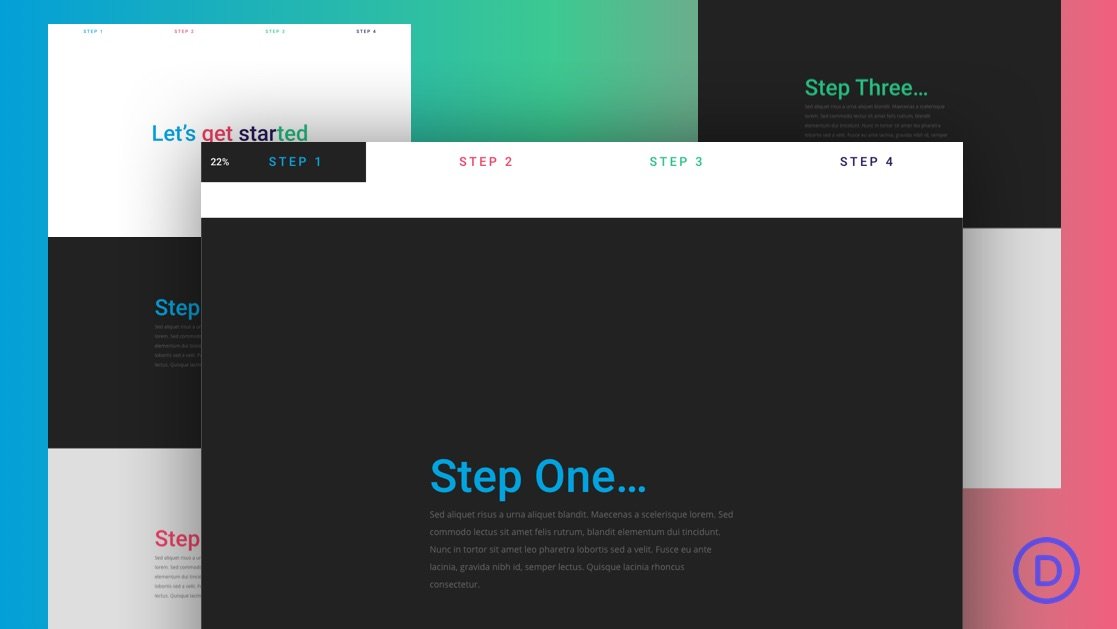
Progress Bar Indicators can add a nice touch to your website, boosting UX with a useful (and fun) interaction. Normally, progress bars stand alone at the top of the page without much connection to the actual content of the page. The user simply has a visual indicator of where they are on the page. But, today, we are going to take this functionality to another level.
In this tutorial, we are going to show you how to combine a scroll progress bar with a fixed navigation menu in Divi. This design is unique in that the progress bar correlates with the width of the menu buttons. And because the width of the menu buttons is equal (in percentages) to the height of the scrollable sections of content on the page, each button will be filled by the scroll progress bar precisely as the user reaches the button’s corresponding section. And if that isn’t enough, we’ll make each button an anchor link to those corresponding sections as well, for an added UX bonus!
This design would be perfect to bring a user through a landing page describing the steps of a process. Well, you’ll see.
