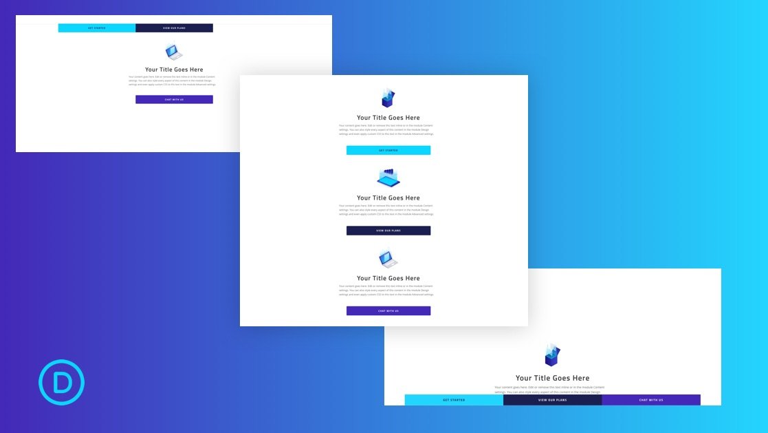
Traditionally, sticky menus are visible at the top (or bottom) of a page the moment the page loads. However, building a sticky CTA menu as the user scrolls down the page can be a creative and effective way to keep those important CTAs clickable at all times. In some ways, it is the best of both worlds. It allows the CTA to keep its prime placement in the original design. And, it keeps a minified version of the CTA (the button) visible in a sticky menu structure users are familiar with.
In this tutorial, we are going to show you how to build a sticky CTA menu as you scroll down the page in Divi. This will work great for desktop and mobile users by adding an intuitive, yet unique, way to entice visitors to take action.


